How to Make a Histogram in Excel

Let’s learn how to build a histogram in Excel with some interesting NBA data. Personally, I use the histogram in my data analyses to help me understand how my data is distributed and to identify any outliers or extreme values that warrant further investigation. In this blog post, I’ll use Kobe Bryant’s playoff career scoring game log as our data source to create a histogram in Excel. Sound fun? Of course, it does. Let’s go!

Inserting a Histogram Chart in Excel

I advocate that you watch the video above for more detail, but you’ll find this blog post equally informative. To create a histogram in Excel, we’ll need a column of numerical data to analyze. In this case, I have Kobe Bryant’s playoff career scoring game log, which shows how many points he scored in each of his playoff games during his career. I referenced this data from basketballreference.com.

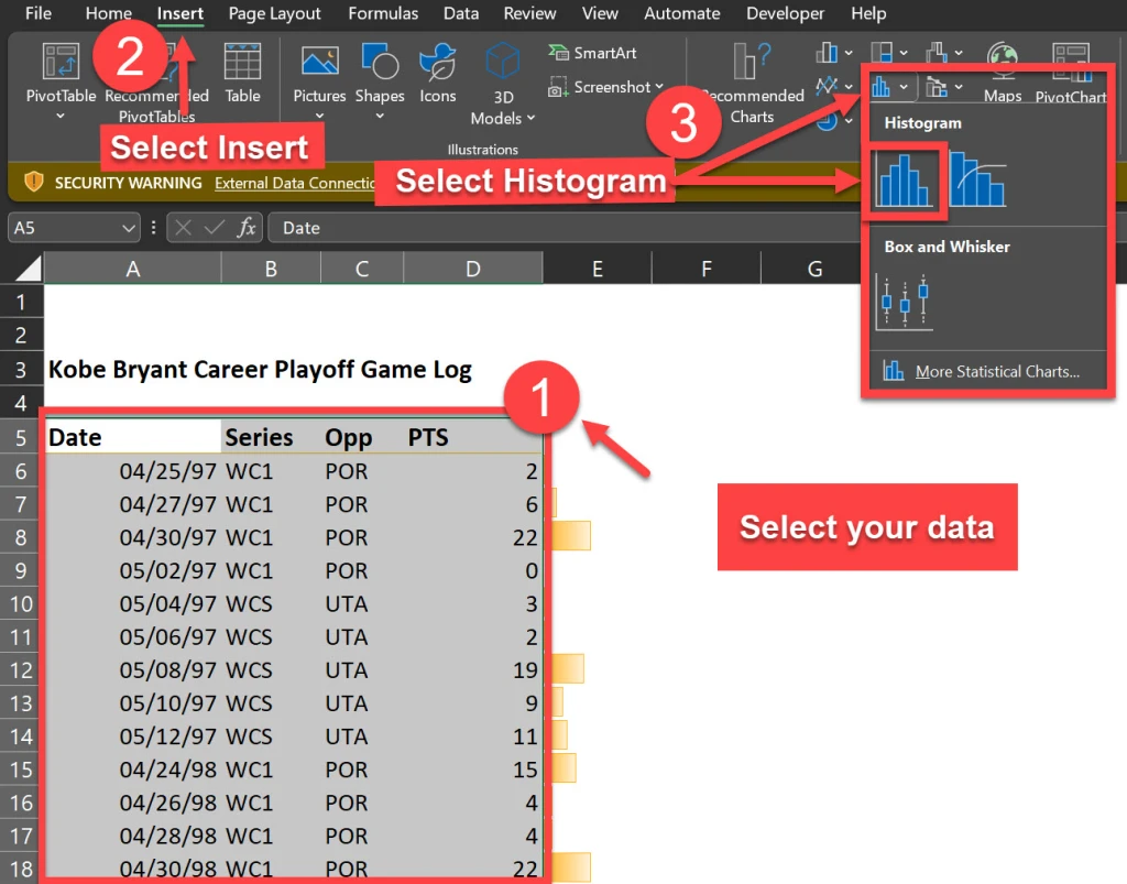
The first step is to highlight the data column and press [Ctrl + Shift + Down] to select the entire range. Then, go to the Insert tab and click on the Histogram icons as shown below. This will insert a histogram chart based on your data.

Formatting the Histogram Chart in Excel

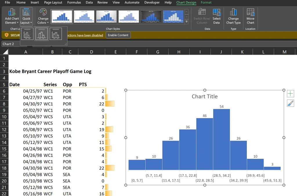
The default histogram chart may not look very attractive or informative. Thus, we will use my personal favorite technique to kick start the formatting (the “easy” way) which is the selection of “Layout 2” as a chart style.

Now this option may be easy (if you’re using Excel 2016 or greater) but you must know which additional options to change in order to make the histogram look more presentable.

The Layout 2 style does an excellent job of removing the horizontal grid lines and vertical axis (so we can keep the Edward Tufte style “chart junk” to a minimum). It also adds data labels to our bar charts as well for interpretation clarity.

Formatting the Histogram Chart in Excel

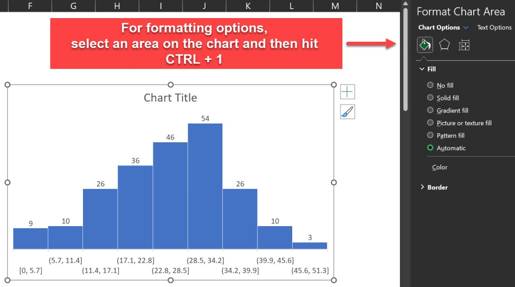
We can further improve our histogram’s appearance by applying some formatting options. For example, we can:

  • Delete the grid lines and the vertical axis that we don’t need (already performed by Layout 2)
  • Increase the font size of the data labels
  • Change the fill color of the bars
  • Add a chart title

To access the formatting options, right-click on any element of the chart and select “Format”. Alternatively, we can hit [Ctrl + 1] to open the Format pane.

Adjusting the Bin Size and the Overflow/Underflow Options in Excel

One of the most important aspects of any histogram is the bin size, which determines how the data is grouped into intervals. The bin size affects the shape and the interpretation of our histogram. We can adjust the bin size by selecting the horizontal axis and changing the “Bin width” option in the Format pane.

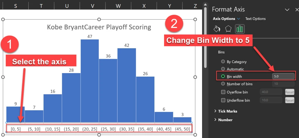
The default bin size for this data set is 5.7, which means that the data is grouped into intervals of 5.7 points. For example, the first bin includes the values from 0 to 5.7, the second bin includes the values from 5.7 to 11.4, and so on.

However, this bin size may not be very intuitive or meaningful. A better option for our histogram is to use a bin size of 5, which means that the data is grouped into intervals of 5 points. For example, the first bin includes the values from 0 to 5, the second bin includes the values from 6 to 10, and so on. This makes the histogram easier to read and understand.

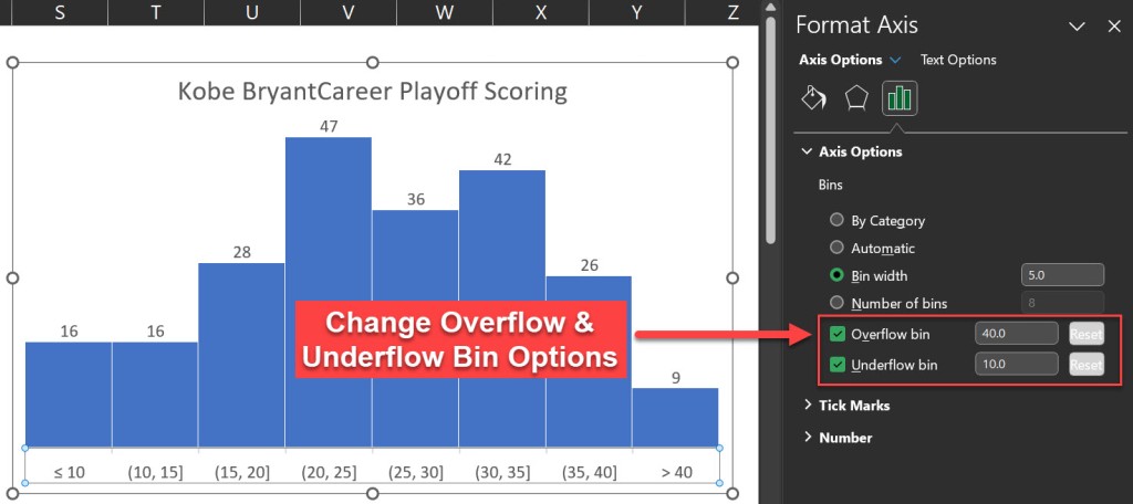
Another option that we can adjust in the histogram chart is the overflow and the underflow bins. These are special bins that capture the values that are above or below a certain threshold.

For example, we may want to create an overflow bin that includes all the games where Kobe scored more than 40 points, and an underflow bin that includes all the games where he scored less than 10 points. To do this, we can select the horizontal axis and change the Overflow bin and the Underflow bin options in the Format pane.

After applying the overflow and the underflow options, the histogram chart looks like this:

Histogram Axis Notation

You’ll notice the histogram’s horizontal axis includes both brackets “[” and parentheses “(“. I will quote the Microsoft blog to explain this notation.

“In our design, we follow best practices for labeling the Histogram axis and adopt notation that is commonly used in math and statistics. For example, a parenthesis, ‘(‘ or ‘)’, connotes the value is excluded whereas a bracket, ‘[‘ or ‘]’, means the value is included. “

In our histogram for example, the notation (20, 25] indicates that the respective bar includes any value greater than 20 but less than or equal to 25.

Interpreting the Histogram Chart and Finding Outliers in Excel

Our new histogram isn’t just pretty, it’s equally informative allowing us to answer questions that we couldn’t easily determine from a wall of numbers in spreadsheet form. The histogram easily helps us understand Kobe’s playoff scoring distribution. We also gain an understanding of his outlier games. For example, we can now:

  • ..locate the mode, which is the most frequent value or interval. In this case, the mode is the interval from 20 to 25, which means that Kobe Bryant scored between 20 and 25 points in most of his playoff games.
  • ..find the range, which is the difference between the maximum and the minimum values. In this case, the range is 50, which means that Kobe Bryant’s playoff scoring varied from 0 to 50 points.
  • ..find the skewness, which is the asymmetry of the distribution. In this case, the distribution is right-skewed, which means that the longer tail of values is on the right side of the distribution. This indicates that Kobe Bryant’s playoff scoring was more concentrated in the lower values. This makes perfect sense as it is much harder to score more points as opposed to lesser points.
  • ..find the outliers, which are the values that are far away from the rest of the data. In this case, the outliers are the point score values that are greater than 40.

I hope you enjoyed this blog post and learned how to create a histogram in Excel to analyze data distribution and outliers!!!

Let me leave you with this highlight package of Kobe’s best dunks:

I appreciate everyone who has supported this blog and my YouTube channel via merch. Please check out the logo shop here.

If you want to learn all the latest tips and tricks in core data analysis tools, stay in contact with me through my various social media presences.

And don’t forget to subscribe to my YouTube channel for more data analyst tips and tricks.

Thank you!!

Anthony B Smoak

Credit Where Credit is Due: Kobe wallpaper created by James Chen <– (great job James!!)

SQL Window Functions – Lead and Lag

The LEAD and LAG window functions in SQL offer the simple yet powerful ability to analyze data beyond the current row. They allow you to access values from rows before and after the current one, without using complex self-joins or subqueries. You can use these two functions to compare values across rows, calculate differences, and perform other operations that require looking ahead or behind in your dataset.

Back when I used Microsoft Access as my main data tool and needed to access information from a previous row to do calculations, I would use VBA coding to implement solutions. At the time, it did not occur to me that I could achieve similar functionality using SQL Server’s LEAD and LAG window functions.

In this highly informative video (if I do say so myself, I’m biased but I’m correct), I show you a use case for the LAG function to calculate the average time for an invoice to move through approver workflow steps. At a high level, this entails subtracting the approval date from a prior row from the current row’s approval date.

LEAD & LAG Window Function Syntax

The LAG window function allows you to access data from a prior row to “look back” dynamically as you query data. This aids calculating deltas, running totals, and more. The syntax of LAG function is as follows:

LAG(column_name, offset, default) OVER (PARTITION BY column_name ORDER BY column_name)

The LEAD window function allows you to access data from an upcoming row to “look ahead” dynamically as you query data. The syntax of LEAD function is as follows:

LAG(column_name, offset, default) OVER (PARTITION BY column_name ORDER BY column_name)

The PARTITION BY clause is key; it that ensures we only look back (or ahead) within a given value in the column_name (for example as shown in the video, an invoice number) otherwise row transitions would provide invalid lookups.

Why Use Lead and Lag functions in SQL?

Using LEAD and LAG functions in SQL can help you analyze your data faster and easier, because you can:

  • Perform calculations and comparisons across rows without using self-joins or subqueries, which can be complex and slow.
  • Avoid exporting your data to Excel or other tools, which can be time-consuming and error-prone.
  • Simplify your code and improve its readability and maintainability.

As I mentioned earlier, if I had known about these two functions years ago when I was trying to access prior values via VBA and loops, I could have saved myself a lot of time, increased my efficiency and made my approach much easier to read in the resulting documentation.

Conclusion

I believe that learning from examples is critical for mastering both logical concepts and SQL syntax. By watching the linked video, you will gain the knowledge to tackle similar problems in your own data analysis scenarios.

Additionally, LEAD and LAG provide simpler, set-based solutions for cross-row data comparisons that would otherwise require procedural coding.

LEAD and LAG functions allow you to merge the past and the future!

I appreciate everyone who has supported this blog and my YouTube channel via merch. Please check out the logo shop here.

If you want to learn all the latest tips and tricks in core data analysis tools, stay in contact with me through my various social media presences.

Thank you!!

Anthony B Smoak

The Power BI Decomposition Tree Guide for Data Analysis

I was recently teaching someone how to use the decomposition tree in Power BI and it clicked that this topic would make for a great video lesson. What I love about the decomposition tree is that it enables data analysts to conduct root cause analyses, identify patterns and discover insights that are not readily apparent. For example, if we want to understand the contributing factors to our small business profits based upon the data at hand, this visual fits the need to a tee.

Specifically, the decomposition tree lets you visualize data across multiple dimensions and enables drilling down into your dimensions in any order. As a bonus, it’s also an artificial intelligence (i.e., A.I.) visualization, so you can ask it to find the next dimension to drill down into based on certain criteria.

This A.I. also had the “answers”

The picture below illustrates how our Smoaking Coffee Company Profits can be subdivided by dimensions across the top of the visual. Massachusetts apparently likes their coffee (Smoaking Coffee is hypothetically better than Dunkin’).

Absolute vs Relative AI Splits

Another benefit of the decomposition tree is the ability to choose between two types of AI splits: absolute and relative. AI splits are the automatic breakdowns that Power BI suggests based on your data.

Absolute AI splits show you the highest or lowest contributors to the measure you are analyzing. In my example, if we are looking at profit by market size, the absolute AI split for high value will show us the market size that has the highest profit, in this case the Central region with $59,337 in profit.

Relative AI splits shows us the most interesting or unusual contributors to the measure we are analyzing. For example, if we switch the Analysis type to Relative from Absolute and perform the same analysis, the relative AI split will show us the product category that has the highest profit compared to its expected value based on the other categories. In this instance it is the Colombian coffee with $44,131 in profit. This number is lower than the absolute value of $59,337, but relative to it’s other product peers, it stands out.

You can switch between absolute and relative AI splits by going to the format visual pane and selecting the analysis option. You can also choose whether you want to see the high or low values by clicking on the arrow next to the plus sign on the actual decomposition tree values.

Drill Through to Details

The decomposition tree is a great way to get a high-level overview of your data, but sometimes you may want to see the details behind the numbers. For example, if you are looking at profit by region, you may want to see the individual transactions that make up the profit for a specific region.

Power BI allows you to drill through to another page that shows the details of your data. To do this, you need to have a detail page that has the same measure as the one you are using in the decomposition tree. For example, if you are using profit as your measure, you need to have a detail page that has profit as well.

To drill through, you need to right-click on a node in the decomposition tree and select drill through to your detail page.

This will take you to the detail page and apply the filters based on the path you followed in the decomposition tree. For example, if you drilled through to the product value of Colombian, you will see the details of the profit transactions for products noted as Colombian.

This is a very useful feature that allows you to see the underlying data behind the summary. You can also use the back button to go back to the decomposition tree and explore other paths.

Use Bookmarks to Save and Share Your Analysis

Another cool feature of the decomposition tree is that it fully supports bookmarks. Bookmarks are a way to save and share your analysis with others. You can use bookmarks to capture the state of your report, including the filters, slicers, and visuals.

To create a bookmark, you need to go to the view tab and select bookmarks pane. Then, you need to click on the add button to create a new bookmark. You can give it a name and a description to make it easy to identify.

You can also link your bookmarks to buttons or images on your report. This way, you can create interactive scenarios that allow you to switch between different views of your data. For example, you can create a button that shows you the decomposition tree for the lowest state profit value and associated region.

To link a bookmark to a button or an image, you need to select the button or the image and go to the action option in the format shape pane. Then, you need to turn on the action and select bookmark as the type. You can then choose the bookmark that you want to link to the button or the image.

Using bookmarks, you can create dynamic and engaging reports that showcase your analysis and tell a story with your data.

Some Final Tips

Before I conclude, I want to share some final tips on how to use the decomposition tree in Power BI.

  1. You can rename your dimensions in the decomposition tree by selecting them in the Visualizations pane “Explain By” area. Simply right click on a value and select “Rename for this visual”. This can help you to customize the labels and make them more meaningful.
  2. You can lock the values in the decomposition tree by selecting the area to the left of the dimension name at the top of the decomposition tree visual (select the light bulb if the dimension was placed in the visual by AI). This will prevent the users from changing the nodes or the AI splits. This can be useful if you want to fix the analysis and avoid confusion.
  3. The maximum number of levels and data points that can be displayed in the decomposition tree are 50 levels and 5000 data points. I hope you never get to that point, however if you’re at that point, just start over; your visual is way too cluttered.

Conclusion

Watch the video to understand how you can use the decomposition tree in Power BI to analyze your data and conduct root cause analyses.

Yes I did get carried away with AI in the thumbnail picture for this video. I was always a fan of the John Stewart version of Green Lantern so I had to play around with AI to get a close approximation of me as a Lantern. May the decomposition tree work for you in brightest day and darkest night!!

I appreciate everyone who has supported this blog and my YouTube channel via merch. Please check out the logo shop here.

If you want to learn all the latest tips and tricks in core data analysis tools, stay in contact with me through my various social media presences.

And don’t forget to subscribe to my YouTube channel for more data analyst tips and tricks.

Thank you!!

Anthony B Smoak

From Data Ownership to Data Analytics: Reflections on the Black is Tech Conference

I had the honor of serving on a panel discussion at this year’s Black is Tech conference at the Georgia World Conference Center (GWCC) in Atlanta. The panel’s theme was “How do we really own our Data? Collecting, Analyzing, Visualizing and Using Black Data for Black Success”. A few of my great co-workers presented me with an opportunity to speak. I must admit that I was a bit reluctant at first due to the fact that it would take me some time to develop a presentation worthy of the event. However, I eventually embraced the opportunity when I was invited to join a panel discussion.

Upon seeing the panel’s title, I was immediately drawn to the visualization aspect, given my belief in data visualization as a crucial tool for data analysts. The “how do we really own our data” part made me think a bit. “Can we really own the data?” Cue the existential pondering.

Anthony Smoak, panelist at the Black is Tech Conference '23. Atlanta, Georgia.
Candid shot of me laughing at… something.

I believe there are two divergent approaches to answering this question. The strategic aspirational response is that Black people need access to capital enabling the creation of technology companies that can “own” data. As we no-doubt understand, access to capital is required in a capitalistic society but history has shown that this access has been systematically denied to Black Americans.

On the other hand, the pragmatic and short-term approach to “owning our data” involves tactics like blocking cookies on browsers and engaging more attentively and playing Whack-a-Mole with those pesky website pop-ups (admittedly, quite distinct strategies).

I had the great fortune of sharing the stage with Annie Sutton who is a Sr. Director of Analytics at Microsoft. Upon arriving at the GWCC and gazing at the conference’s main stage, we were awestruck by its size.

Once we were miked up behind the stage curtains and stepped onto the stage, we became the main act. I faced the first question, which was directed at me: “Bias in algorithms and artificial intelligence systems can disproportionately impact minority groups. How can technology companies ensure that the models they create do not perpetuate these biases and instead promote equity?” 

In response, I outlined three key points, which I’ll summarize briefly. Diverse teams are essential for developing models and AI systems, along with the inclusion of diverse data in these models. Additionally, transparency in the operations of these AI models is imperative. We have to let the sun shine in and make these models very transparent. I gave a nod to the work of Dr. Joy Boulamwini (Georgia Tech and MIT graduate) who addresses AI bias issues and ways to counteract them.

The panel addressed various questions, including data literacy, which Annie Sutton addressed so well. I offered an anecdote regarding how I taught my grandmother to use ChatGPT on her iPad to develop rough outlines for her weekly sermons. She is 80 plus years young and still not too old to pick up new data skills to keep up in her profession.

I also fielded a question about Black professionals I follow in the data visualization space. I gave a shoutout to Chantilly Jaggernuath, Tim Ngwena, Chimdi Nwosu, Sekou Tyler and Patrick LeBlanc. Are there others who inspire me? Of course there are, but these were the people that first came to mind.

I believe visible Black role models in analytics are vital for inspiration and challenging the stereotype that success in analytics work is unattainable for us. By sharing our journeys and achievements, we illuminate the possibilities for young Black students trying to enter the data sphere. We’re breaking the stereotype that analytics is a members-only club.

I’m grateful that I can earn a living (a good living, I’ll add) through data and analytics work while using the internet to disseminate my work and tutorials and serving as a positive role model in this field.

All in all, my experience on the panel at the Black is Tech conference was immensely enjoyable. It’s heartening to experience the significant presence of professionals, entrepreneurs, and creators in the tech realm. Conferences like Black is Tech play a crucial role in meeting the community’s needs.

I appreciate everyone who has supported this blog and my YouTube channel via merch. Please check out the logo shop here.

Stay in contact with me through my various social media presences.

Thank you!!

Anthony B Smoak

Create Stacked Area Chart Totals In Tableau

In this video, we’re going to tackle an interesting little challenge – adding dynamic totals to stacked area charts in Tableau. While this may not be a technique for production-ready charts, it’s perfect for those one-time presentations or exports to PowerPoint.

Recently, I had a fantastic 90-minute private data tutoring session with someone who contacted me via this website. During this session, we worked together to address three different data issues, one of which was the quest to display totals for stacked area charts. With some creative thinking and a dash of Tableau magic, I found a solution that I’m excited to share with you.

Use the timestamps below to navigate directly to your desired point in the video.

  • 0:43 Intro to Area Chart
  • 1:38 Chart Build
  • 2:38 Totals by Year
  • 4:14 Dashboard Layout
  • 5:19 Fixed LOD Formulas
  • 6:35 Bonus Tip

If you’re “short” on time and want to see the 1 minute version, I have you covered as well

I appreciate everyone who has supported this blog and my YouTube channel via merch. Please check out the logo shop here.

Stay in contact with me through my various social media presences.

Thank you!!

Anthony B Smoak

Creating Sankey Charts the Easy Way with Tableau

Historically, creating Sankey charts in Tableau has been a time-consuming process, often requiring the use of complex templates. However, the team at Tableau Public has introduced a game-changing functionality that allows us to create Sankey charts effortlessly. This feature, currently in beta and available for a limited time (like the McRib of data visualizations), enables us to author and publish Sankey charts directly to our Tableau Public profiles.

In this blog post, I’ll briefly walk you through the process of creating one using Tableau Public.

What is a Sankey Chart?

Before we delve into the specifics of this new Tableau Public feature, let’s take a moment to understand what a Sankey chart is and why it’s such a powerful visualization tool. A Sankey chart is a flow diagram that illustrates the movement of data, be it goods, energy, or even money. With a Sankey chart, you can effortlessly compare different data points and identify patterns that might remain hidden in traditional charts or tables.

Testing Out the New Feature

Assuming you already have a Tableau Public profile (and if you don’t, I highly recommend creating one—it’s an incredible platform for sharing your data visualizations with the world). You’ll need to create a visualization directly from your Tableau Public page.

Once you’ve created your visualization, navigate to the “Connect to Data” section. As we’re uploading data from our computer, select the “Upload from Computer” option. Choose the dataset you want to work with—I’ll be using the “Sample Superstore” dataset for this example. After confirming that your data has been successfully imported, select the “Sankey” chart type.

Now, here’s where the magic happens. You’ll notice a “Level” and “Link” section that appears. To define the flow in the Sankey chart, let’s select a dimension like “Segment” and drag it into the “Level” area. Next, grab another dimension—I’ll choose “Region”—and place it in the “Level” area as well. Finally, to quantify the flow, let’s choose a measure like “Sales” and place it in the “Link” area.

Voila! With just a few clicks, we’ve created a Sankey chart. Impressive, isn’t it? You’ll notice the flow between the segments and regions instantly come to life. But we’re not done yet—let’s keep the party going by adding another level.

For the sake of experimentation, let’s grab a dimension like “Ship Status” and drop it into the visualization. Now we have an additional sub-level in our Sankey chart. To avoid overcrowding, we can uncheck the “Allow Labels to Overlap” option, ensuring our chart remains clean and legible.

Keep Innovating for The Analytics Core Audience

Tableau Public’s decision to incorporate this feature highlights their commitment to democratizing data visualization. While the addition of features like Sankey charts to Tableau Public is fantastic, it’s essential that the overlords at Salesforce remember Tableau’s core audience—the general analytics users who are generally decoupled from Salesforce usage. Let’s keep hoping for bigger and better things to come with the tool. This beta signals that they’re heading in the right direction.

I appreciate everyone who has supported this blog and my YouTube channel via merch. Please check out the logo shop here.

Stay in contact with me through my various social media presences.

Thank you!!

Anthony B Smoak

(Note: The mentioned feature and availability were accurate as of the blog post’s publication date, but please refer to the Tableau Public documentation for the latest updates and information.)

Learn Advanced Tables in Tableau (Step by Step)

TLDR

Yes I put an AI version of myself on the thumbnail. I obviously “Quantum Leaped” from the future to teach you these Advanced Tableau table skills that you’ll encounter in the accompanying video.

Be warned, this is Highly Advanced Tableau!! In the main video, we’ll explore how to generate advanced tables in Tableau (step by step), complete with multiple chart elements displayed on the same table row. It’s OK, you can click the area below since it leads to a YouTube short.

Intro

As a data enthusiast and Tableau user, I always strive to learn new things, experiment with different techniques and share my knowledge with others. Recently, I came across a visualization by Zainab Ayodimeji that caught my attention. Zainab is a Tableau Ambassador and her work is always top-notch, so I reached out to her and asked if I could reverse engineer one of her vizzes for a video. She was cool with it, so I got to work.

The visualization that caught my eye was an advanced Tableau visualization that used normalized data to create sales and profit sparklines for using standard Superstore data. Zainab’s visualization featured a variety of different chart elements, all on the same row, and looked incredibly cool.

I was immediately intrigued and wanted to see if I could reproduce something similar myself, but with a different data set other than the ubiquitous Superstore. So, I got to work on reverse engineering and came up with my own take on Zainab’s visualization.

I discovered that the technique used in her viz was innovated by Sam Parsons, so I also checked out his video on this technique and found it ingenious; very MacGyver like. Sam’s innovative video is the inspirational source for all of these techniques. Watch his video for the concepts, watch my video for practical hands on building.

Watch the Step by Step Re-creation Video to Learn this Advanced Technique

In the video below, I will explain step by step how I used Tableau to create a compelling chart example that will help my viewers understand the Advanced Tableau calculations and concepts it takes to visualize multiple types of charts on one table row.

The dataset that I worked with contained information about the sales and profits of different products sold at a coffee shop as opposed to Superstore data. Recreating the data with a different dataset forced me to understand the concepts better than just copying and pasting the existing code in Zainab’s visualization.

The Reviews are In

Y-Axis Positioning Trick – (How this Process Works)

One of the coolest concepts in this process is the positioning of the chart elements on the same Y-Axis. Again, a big shoutout to Sam Parsons for coming up with these techniques!

The y-axis position is critical because it determines where each data point will be plotted on the chart. As a result of the ingenious calculation, Tableau places all non-line chart elements at a y-axis position of 0.5, which is the middle of the y-axis. However, for line chart elements, the y-axis position is calculated based on the normalized sales or profits value.

To normalize the data, we make the values of the sales and profit of each product fit between a range of 0 and 1 for a consistent Y axis. This allows us to see the trends of the sales and profits of each product at a standard consistent height on the visual.

The sales or profit axis test (a calculated field) determines whether the normalized sales or profits value should be plotted if the chart element is a line. If the test returns a value of 1, Tableau will plot the normalized sales value. If it returns a value of 0, Tableau will plot the normalized profits value. This is determined by checking whether the sales access product field is present in the detail section of the view.

Download the Workbook for This Technique

Download at this link.

Conclusion

I just realized that I used Quantum Leap and MacGyver references in the same blog post (gettin’ Ziggy with it). After watching my video above, you’ll be able to create an insightful visualization using clever and unconventional methods (not unlike MacGyver making a jetpack out of a toothpick and a piece of gum).

Again, big thanks to Zainab and Sam for influencing this work so I could teach you how to Quantum Leap forward in your Tableau skills (Ok I’ll stop with the puns). Keep doing great things with your data!

I appreciate everyone who has supported this blog and my YouTube channel via merch. Please check out the logo shop here.

Stay in contact with me through my various social media presences.

Thank you!!

Anthony B Smoak

10 Items to Know When Starting A New Data Project

Are you a data professional looking to start a new data project?

Then you need to review my 10-point checklist to make sure you’re on the right track. Starting a new data project can be overwhelming. But don’t worry, with my 20 years of experience, I’m here to guide you through it.

Typically when I start to perform a new data related task or analysis for a project, I have to make sure that I meet the expected objectives, which often include identifying patterns, trends, and insights that can be used to drive business decisions.

10 Point Checklist

Point 1: First things first, you need to understand the nature of the deliverable that’s being asked for. Is it a new report, database table, column, data visualization, calculation, or a change to any of the above? In a similar fashion you also need to understand the technologies in play that you have to work with. This could be anything from Tableau, Power BI, SQL Server, Oracle, Teradata or even Microsoft Access (yes, people still use this tool).

Point 2: It’s crucial to know the desired delivery time frame for your project. You don’t want to end up with a longer timeline than what the project manager or client had in mind. Communication is key in this situation.

Point 3: Who is the intended audience for this deliverable? If it’s for an executive audience, you may need to roll the numbers up and take out some detail. If it’s for an analyst or operational audience, you may want to leave in more detail.

Point 4: How much historical data is required? What is the anticipated volume of data that your deliverable is going to generate? Don’t get caught in a situation where your solution can’t handle the trending analyses for a 2 year time frame when you only pulled data for the last 6 months.

Point 5: Understand the volume of data that your solution will generate. For example, a 5 million row output is not conducive to a 100% Excel approach. You will definitely be in the land of database analyses. However you may later present the data at an aggregated level (see point 3) via Excel but hopefully using a real data visualization tool .

Point 6: You need to understand if there’s any Personally Identifiable Information (PII) or sensitive data that you need to access in order to carry out the request. This could include social security numbers, passport numbers, driver’s license numbers, or credit card numbers.

Point 7: It’s important to understand the business processes behind the request. As data people, we tend to focus only on the data piece of the puzzle, but understanding more about the relevant business process can help you deliver the better results for your end users.

Point 8: Try to find and understand any relevant KPIs associated with the business processes on which your data project/task is affecting.

Point 9: Perform data profiling on your datasets! This can’t be stated enough. Profiling leads to understanding data quality issues and can help lead you to the source of the issues so they can be stopped.

Here are a few data profiling videos I’ve created over the years to give you a sense of data profiling in action.

Point 10: Understand how your solution will impact existing business process. By changing a column or calculation, how does this impact upstream or downstream processes? Keep your email inbox clean of those headache emails that are going to ask why the data looks different than it did last week. Most likely there was not a clear communication strategy to inform everyone of the impact of your changes.

Bonus Considerations:

Here are a few bonus considerations since you had the good fortune of reading this blog post and not just stopping at the video.

Bonus Point 1: Consider any external factors that could impact your data project. For example, changes in regulations can impact the data that you collect, analyze, and use. If the government imposes stricter regulations on data privacy (see point 6 above), you may need to change your data sources or analysis methods to comply with these regulations.

Bonus Point 2: Consider internal organizational politics when starting on a project. If you work in a toxic or siloed organization (it happens), access to data can be a challenge. For example, if the marketing department controls customer data, accessing that data for a sales analysis project may be challenging due to internal strife and/or unnecessary burdensome roadblocks.

Internal politics can also lead to potential conflicts of interest, such as when stakeholders have different goals or agendas. For example, if your data analyses could impact a department’s budget, that department may have an incentive to influence your work outcome to their advantage (or try to discredit you or your work by any means necessary).

Bonus Point 3: Finally, make sure to document everything. This includes the business requirements, technical requirements, saved emails, and any changes that were made along the way.

When I started my first office position as an intern at a well known Fortune 500 company, my mentor told me the first rule of corporate life was to C.Y.A. I’m sure you know what that means to cover. Having solid documentation of your work and an email trail for decisions made along the way can keep you out of hot water.

Conclusion

And there you have it, my 10-point checklist for starting a new data project. By following these steps, you’ll be well on your way to delivering high-quality results. Don’t forget to like and subscribe for more data-related content!

I appreciate everyone who has supported this blog and my YouTube channel via merch. Please check out the logo shop here.

Stay in contact with me through my various social media presences.

Keep doing great things with your data!

Anthony B. Smoak

Learn GROUP BY vs PARTITION BY in SQL

TLDR

If you are using SQL, you will eventually come across the GROUP BY and PARTITION BY clauses. While the Group BY clause is fairly standard in SQL, most people do not understand when to use the PARTITION BY clause. This easy to understand video uses some NBA season data to make the point very clear! I will show you the best use case of when to apply PARTITION BY.

Bonus content begins at the 10:03 mark, where I demonstrate a use case for the fundamentals I teach you earlier in the video.

The reviews are in, make sure to watch the whole video!

GROUP BY EXAMPLE

To begin, I demonstrate how to use GROUP BY in SQL Server Express to understand basic NBA team statistics based strictly upon the conference. I have to tell the database what to GROUP BY to generate all of the aggregate statistics. I select the conference and want to generate the aggregate sum of points, average points, and max points. I also order the results by the sum of points in a descending fashion.

When I run the query, the results show how the data points have been grouped by conference. The results show the sum of points by the two values in the conference field (Western and Eastern), the average points, and the max points. I can also see that there are no individual rows in this result, which is expected when using the GROUP BY clause with aggregate functions like MIN, MAX, SUM, and COUNT.

If I want to further break down the results and throw in a division, I need to also select the division field and add it to the GROUP BY statement as well. This action further slices the data points into specific conference and divisions that the teams play in.

PARTITION BY

Now, let’s talk about the OVER and PARTITION BY sub-clause. In this next example, I select the conference and bring in the points, which is our measure. Just like with GROUP BY, I sum the points, but I add “OVER” and the sub-clause “PARTITION BY.” This is where the magic happens because I tell SQL what data point to Partition by (i.e., conference) to show the total sum of points by conference.

When I run the query, the results show the sum of points by conference, and I can order the results by individual team points in descending order . The results show a breakdown of the sum of points by conference, but there are still individual rows in the results.

Here is a continuation of the same results for the Western conference teams:

This is an important distinction!! By using OVER and PARTITION BY, I can have data at the most granular level (unaggregated points at an individual team level i.e., the PTS field) combined with data at a higher granularity (points summed, averaged and the maximum points scored at an overall conference level).

The higher granularity of the data at the conference level makes the values for the last three statistics columns repeat (i.e., 135611 for SUM_PTS, 9040 for AVG_PTS and 9470 for MAX_PTS in the Eastern Conference). Similar data is returned for the Western conference.

I’m essentially allowed to have my data cake and eat it too with this best of both worlds approach!

IN SUMMARY

The GROUP BY statement is used to group rows that have the same values in a specific column or set of columns. When used with aggregate functions such as SUM, AVG, MAX, MIN, COUNT, etc., the GROUP BY statement allows us to calculate summary statistics for each group. The result will yield one row for each group. Typically, a GROUP BY statement will reduce the number of rows returned by your SQL.

On the other hand, the PARTITION BY statement is used to divide the data into partitions or subsets based on a specific column or set of columns (like conference in our case). Unlike GROUP BY, PARTITION BY does not reduce the number of rows returned in the result set. Instead, it adds a new column that shows the result of the aggregate function (e.g., SUM, AVG, MAX, etc.) for each partition.

LET PAT BEV COOK

So remember, when it comes to GROUP BY and PARTITION BY in SQL, just like how the Minnesota Timberwolves balanced an effective array of shots to lead the league in total points scored, understanding the nuances of when to use each statement can make all the difference in winning that crucial play-in game against your data! Yes you have to watch the video to understand this reference.

Also, I’m not bad at Pat Bev for going over the top, as this win was against a former employer who recently traded him. Success is always the best revenge!!

Happy querying!!

I appreciate everyone who has supported this blog and my YouTube channel via merch. Please check out the logo shop here.

Stay in contact with me through my various social media presences.

Thank you!!

Anthony B Smoak

Perform Fuzzy Matching in Tableau Prep

TLDR

Life is too short for exact matches!

In this video I will build out a Tableau Prep flow that demonstrates one approach to perform fuzzy matching. We’ll perform the fuzzy matching technique on two lists of companies. One list contains a standardized list and the other contains a non-standardized list, and we will match them together using Tableau’s fuzzy algorithm.

Intro

As a working data professional, one of my main responsibilities is to ensure the accuracy and consistency of the data that I work with. One of the challenges I face is dealing with different variations of company names that may exist in different datasets. In the video above, I walk you through a fuzzy match join that I recently performed using Tableau Prep, a data preparation tool, to reconcile these variations.

What is Fuzzy Matching?

First, I want to introduce you to the concept of fuzzy matching. It’s a technique used to match data when there are slight differences in how the data is presented (most likely as a result of bad data governance). For example, if you have two data sets with company names, one may list a company as “Apple Inc.” while the other may list the same company as “Apple Incorporated.” Fuzzy matching would help you match these two records, even though the names are slightly different.

In Tableau Prep, unfortunately fuzzy matching is not a straightforward process like it is in Excel or other tools like Power BI or Alteryx. However, we can use a workaround to achieve a somewhat similar result. Tableau Prep allows you to automatically group values together using fuzzy-match algorithms that find similar values.

High Level Flow Process

To get started, let’s say we have two lists of companies. One is a master list of companies that we want to use as our reference, or “golden” copy. The other is a list of companies that may be misspelled or unstandardized. We want to join these two lists together using fuzzy matching (although technically we employ fuzzy grouping options to enable traditional matching).

Within Tableau Prep I start with two groups of data, a clean “golden copy” of company names and a list of company names that contain poor data quality (i.e., user-entered data, which may have misspelled or unstandardized company names).

Once we have imported both data sets, we can append them using a union step. The union will combine the two lists of company names into one.

Next, we need to perform a fuzzy algorithm on the list of company names. Remember that both the golden copy and the misspelled names are stacked into one column. In Tableau Prep, we’ll use the fuzzy grouping capability to group together similar values, even if they’re not exact matches. We’ll use this technique to group the misspelled company names with their correct counterparts in the “golden” copy.

Granted this approach does not scale terribly well over a large dataset because we need to eyeball each grouping to ensure it is acceptable, but it is a good start. I don’t know of any fuzzy algorithm that guarantees 100% results, as “fuzzy” is inherent in the name of the approach.

Here are a couple of must read posts from the Tableau Knowledge Base for Fuzzy Grouping if you want to understand these automated grouping options:

After the values in the combined column are grouped together into a standardized clean format, we simply need to deduplicate our values so we are left with a 1 to 1 mapping between the incorrect data and the cleaned up result of the fuzzy grouping. We can use this “translation table” as a means to join our Golden Copy dataset to the less standardized dataset (which has the sales data we need to analyze).

Result

By using fuzzy match and Tableau Prep, I was able to successfully reconcile the variations in the company names and match the sales quotes in the “poor data quality” company names data set to their corresponding IDs in the clean golden copy names data set. If you’re stuck in this kind of a scenario at work, use this process to advocate for a cleanup of the data quality at the source of entry or creation.

In conclusion, fuzzy matching is a powerful technique that can help you match data even when the data may not be spelled correctly or may have slight variations. Tableau Prep may not have a straightforward fuzzy matching feature (a la Excel), but we can use fuzzy grouping to achieve similar results.

Here is a pic of the flow we build in the video. I add additional steps for this unique case but ideally to perform the fuzzy grouping we could stop much earlier in the process.

Additional “Fuzzy” Videos (Not Quality Wise, Topic Wise)

I appreciate everyone who has supported this blog and my YouTube channel via merch. Please check out the logo shop here.

Stay in contact with me through my various social media presences.

Thank you!!

Anthony B Smoak